Colors and Light – How They Affect the Perceived Comfort of a Chair

Colors and Light – How They Affect the Perceived Comfort of a Chair
When we sit down, comfort isn’t only about cushioning, ergonomics, or materials. The environment around the chair—especially colors and lighting—plays a much bigger role than most people realize. Our senses work together, and the visual atmosphere can change how we perceive warmth, space, and relaxation. Let’s take a closer look at how colors and light influence the perceived comfort of a chair—and how you can use that knowledge to create a more inviting space.
The Psychology of Color – More Than Just Style
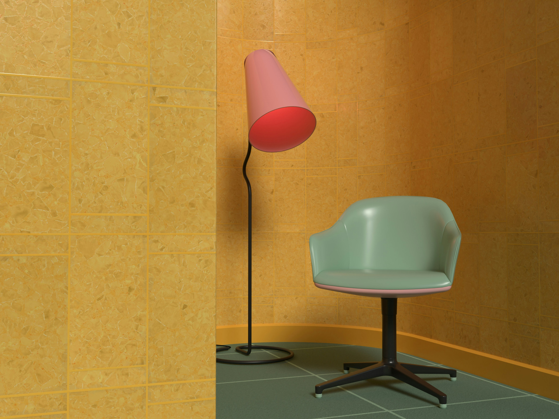
Colors affect both our mood and our physical sensations. A chair in a warm shade like terracotta, mustard, or deep red can feel cozier and softer, even if it’s made from the same material as a chair in cool tones. That’s because warm colors are associated with comfort and closeness, while cool colors like blue and gray often evoke calmness and distance.
- Warm colors create a sense of coziness and comfort but can feel heavy in small spaces.
- Cool colors give a fresh, airy impression but may seem less “soft.”
- Neutral colors such as beige, sand, and gray act as flexible backdrops, where texture and lighting play a bigger role in how comfortable the chair feels.
When choosing a color for a chair, it’s not just about matching your décor—it’s about shaping the emotional atmosphere around it.
The Role of Light in Comfort Perception
Light can transform everything. A chair that looks warm and inviting in daylight might appear cold and stiff under bright, white artificial light. Lighting affects both how colors appear and how our bodies respond to a space.
- Natural light highlights the authenticity of materials and creates a relaxed atmosphere.
- Warm artificial light (with a lower color temperature) adds coziness and makes fabrics and wood appear softer.
- Cool light (with a higher color temperature) feels more energetic and functional but can make a room less inviting for relaxation.
The placement of the chair in relation to windows and lamps also matters. A chair in a softly lit corner often feels more comfortable than one in direct sunlight or under a harsh ceiling light.
The Interaction of Color, Light, and Material
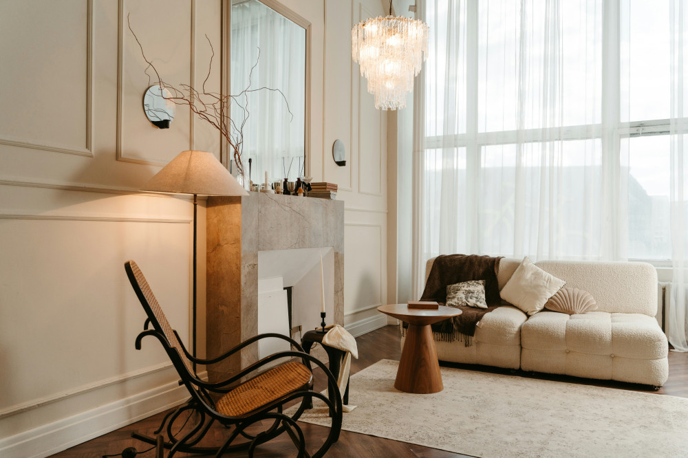
True comfort emerges from the interplay between color, light, and material. A dark brown leather chair can feel heavy in a dimly lit room but warm and elegant in golden afternoon light. A light fabric chair, on the other hand, may feel fresh and airy in daylight but cool under LED lighting.
Think about how your chair will look at different times of day. For a reading nook, choose a chair in a warm tone and pair it with a lamp that casts a soft, warm glow. In a workspace, cooler colors and more neutral lighting can help promote focus and clarity.
Designing Comfort Through Color and Light
Designers increasingly treat color and light as active elements in furniture design. It’s not just about aesthetics—it’s about creating a holistic experience where body and senses align. A chair can be physically comfortable, but it only feels truly inviting when the surrounding environment supports the right mood.
If you want to enhance comfort at home, start with small adjustments:
- Replace the bulb near your favorite chair with one that emits a warmer tone.
- Move the chair closer to a window to take advantage of natural light.
- Experiment with pillows or throws in colors that evoke the feeling you want.
Comfort Is Also About Atmosphere
Ultimately, comfort is a complete sensory experience. It’s not only about how the chair supports your body but also about how the space makes you feel. Colors and light can transform an ordinary chair into a place you naturally gravitate toward—to relax, read, or simply think. When you find the right balance, the chair becomes more than just furniture—it becomes a small sanctuary in your everyday life.